If you’ve ever wondered why some Shopify stores instantly capture attention and convert visitors into buyers while others struggle, the answer often comes down to one critical factor:
Your store layout.
Not the niche.
Not the theme.
Not the product.
Not the ad strategy.
Your layout—the structure, design flow, and user experience—determines more than 70% of your conversion rate.
A confusing layout can kill a sale within seconds.
A clean, intuitive, persuasive layout can turn even a beginner store into a high-converting machine.
This guide reveals the exact Shopify layout used by top ecommerce brands and successful Shopify entrepreneurs, proven repeatedly to increase conversions.
Let’s begin.

Why Store Layout Matters More Than Anything Else
Many beginners think they need:
- A better theme
- More apps
- Lower prices
- More products
In reality, none of these matter if your store layout is weak.
A strategic layout:
- Guides the shopper naturally
- Builds trust instantly
- Reduces friction
- Improves user experience
- Increases Add to Cart actions
- Boosts conversions without extra traffic
Your store layout is the foundation of your entire ecommerce business.

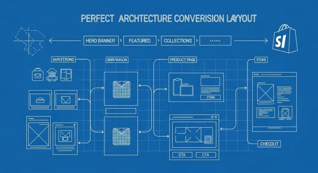
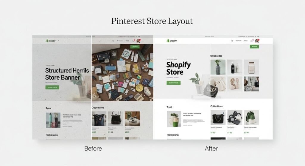
The High-Converting Shopify Store Layout (Proven Structure)
Below is the layout that consistently outperforms every other structure. This format is used by:
- High-performing dropshippers
- Branded ecommerce stores
- Influencer-led stores
- Shopify conversion experts
Follow this framework exactly for maximum impact.
1. The Hero Section
This is the most important part of the entire homepage. It is the first impression your visitor sees, and most people decide within three seconds whether to stay or leave.
Your hero section must include:
- A clear, benefit-driven headline
- One powerful value proposition
- A clean product or lifestyle image
- A bold call-to-action (Shop Now)
- Minimal distractions
Avoid image sliders, autoplay videos, or crowded text.
Example headline:
“Premium Skincare Made with Clean Ingredients.”
Example value statement:
“Designed for visible results in under two weeks.”
A strong hero section alone can increase conversions by 30 to 40 percent.
2. Featured Products Section
Directly beneath the hero section, showcase your best products.
This section must show:
- Large images
- Clear titles
- Prices
- Star ratings
- Visible Add to Cart or Quick View
Visitors want to shop immediately.
Make your top 4–6 products easy to find.
This eliminates scrolling fatigue and improves browsing flow.
3. Collections Overview
An organized store feels trustworthy and professional.
Create clean collection banners for:
- Best Sellers
- New Arrivals
- Product Categories
- Gift Collections
- Seasonal Products
Use large, aesthetic images with consistent colors and style.
This section helps visitors navigate your store effortlessly, improving both engagement and conversions.
4. Why Choose Us (Trust Section)
Trust is everything in ecommerce.
Add a short section explaining why customers should choose your brand. Keep it simple and clear.
Include points such as:
- Fast shipping
- Secure checkout
- Hassle-free returns
- Quality guarantee
- Excellent customer support
This section reduces buyer anxiety and builds confidence.
5. Social Proof Section
Humans buy what other humans approve.
Add:
- Customer photos
- Verified reviews
- Before/after images
- Short testimonials
- Star ratings
Apps like Loox, Judge.me, and Stamped work well here.
Even a handful of authentic reviews can dramatically strengthen credibility and increase your conversion rate.
6. High-Converting Product Page Layout
The product page is where the final buying decision happens. Your product page layout must be highly intentional.
A perfect product page includes:
- A clean title
- Professional image gallery
- A clear price
- Scarcity or urgency (optional but subtle)
- A benefit-focused product description
- A large Add to Cart button
- Variant selectors
- Shipping information
- A reviews section
Avoid long, complicated paragraphs.
Use short bullet points and benefit-driven descriptions.
A powerful product page can double your Add to Cart rate.
7. Sticky Add to Cart Button
A sticky Add to Cart button stays visible as users scroll.
This single feature can increase mobile conversions by 10 to 28 percent.
Without it, customers must scroll all the way back up to add the product, which creates friction. With it, buying becomes effortless.
There are many apps that support this feature, and some themes include it by default.
8. Simple Navigation Menu
A cluttered menu confuses shoppers.
Use a minimal navigation bar with only essential links such as:
- Home
- Shop
- Collections
- About
- Contact
Anything more than this can distract the visitor.
The simpler the navigation, the smoother the user experience.
9. Mobile Optimization
More than 80 percent of Shopify visitors browse on mobile devices, so optimizing for mobile is non-negotiable.
Your mobile layout must:
- Load in under three seconds
- Have large, tappable buttons
- Display images correctly
- Show the Add to Cart button clearly
- Avoid text that’s too small to read
A mobile-optimized store significantly increases conversions because users don’t feel frustrated or overwhelmed.
10. Minimal Checkout
Your checkout page should be as simple as possible.
Enable fast checkout options like:
- PayPal
- Shop Pay
- Google Pay
- Apple Pay
Disable unnecessary fields.
Remove distractions.
Keep the experience straightforward.
A minimal checkout reduces cart abandonment significantly.
Why This Layout Works
This layout is not random. It is backed by:
- Conversion rate optimization principles
- Human eye-tracking studies
- Consumer behavior psychology
- Real ecommerce case studies
It works because:
- It builds trust
- It reduces thinking time
- It guides the user step-by-step
- It removes friction
- It focuses on clarity
- It feels professional
- It makes buying simple
When a visitor feels comfortable and confident, conversions naturally increase.
Common Mistakes Beginners Make
Avoid the following pitfalls:
- Using too many colors
- Adding too many apps
- Overloading the homepage
- Using low-quality images
- Writing long, boring descriptions
- Forgetting reviews
- Creating complicated menus
- Neglecting mobile design
- Using weak calls-to-action
Fixing even a few of these mistakes can dramatically improve conversions.
Final Thoughts: This Layout Is Your Competitive Advantage
This proven Shopify layout is used by successful stores across multiple industries. It is simple, clean, strategic, and optimized for conversions.
Using this layout will help you:
- Increase customer trust
- Reduce bounce rates
- Increase Add to Cart rates
- Improve mobile performance
- Boost overall sales
Whether you run a dropshipping store, a branded ecommerce brand, or a niche store, this layout works consistently.
Want This Layout Built For You?
If you want a professional, conversion-focused Shopify store built using this exact structure, I can create:
- Custom layouts
- High-converting product pages
- Optimized mobile experience
- Branding and design
- Essential apps setup
- Fast delivery
- Full store optimization
Just tell me:
“I want my Shopify store built with this layout.”


